Datylon
About Datylon
Awards and Recognition
Datylon Pricing
Prices excluding VAT, where applicable. All plans include online support. Acceptable use limits apply. Datylon attribution in embedded charts only in the free version.
Starting price:
$19.95 per month
Free trial:
Available
Free version:
Available

Other Top Recommended Business Intelligence Tools
Most Helpful Reviews for Datylon
1 - 5 of 54 Reviews
Natalia
Verified reviewer
Computer Software, 201-500 employees
Used monthly for less than 12 months
OVERALL RATING:
5
EASE OF USE
4
VALUE FOR MONEY
4
CUSTOMER SUPPORT
5
FUNCTIONALITY
4
Reviewed February 2023
The best one I tried
Overall, my experience was positive - it works fine for my needs which is creating layouts for reports and infographics.
PROSI like that it has a lot of customization features (still would love to have much more options!). Once you set up a template of a graph, exchanging data is extremely easy.
CONSMy problem is really specific - round graphs and text labels just don't work - if you want to make everything readible and lookind nice you have to add your labels seperately which is extremely annoying.
Reasons for switching to Datylon
We were limiting our used software to Adobe only.
Alexandros
Design, 2-10 employees
Used weekly for less than 12 months
OVERALL RATING:
5
EASE OF USE
4
VALUE FOR MONEY
5
FUNCTIONALITY
4
Reviewed August 2021
Must have for data visualisation
Datylon saved my day with big report documents, obtaining excellent results; yet, the learning curve is steep and you have to be creative sometimes to get always what you want from your graphs.
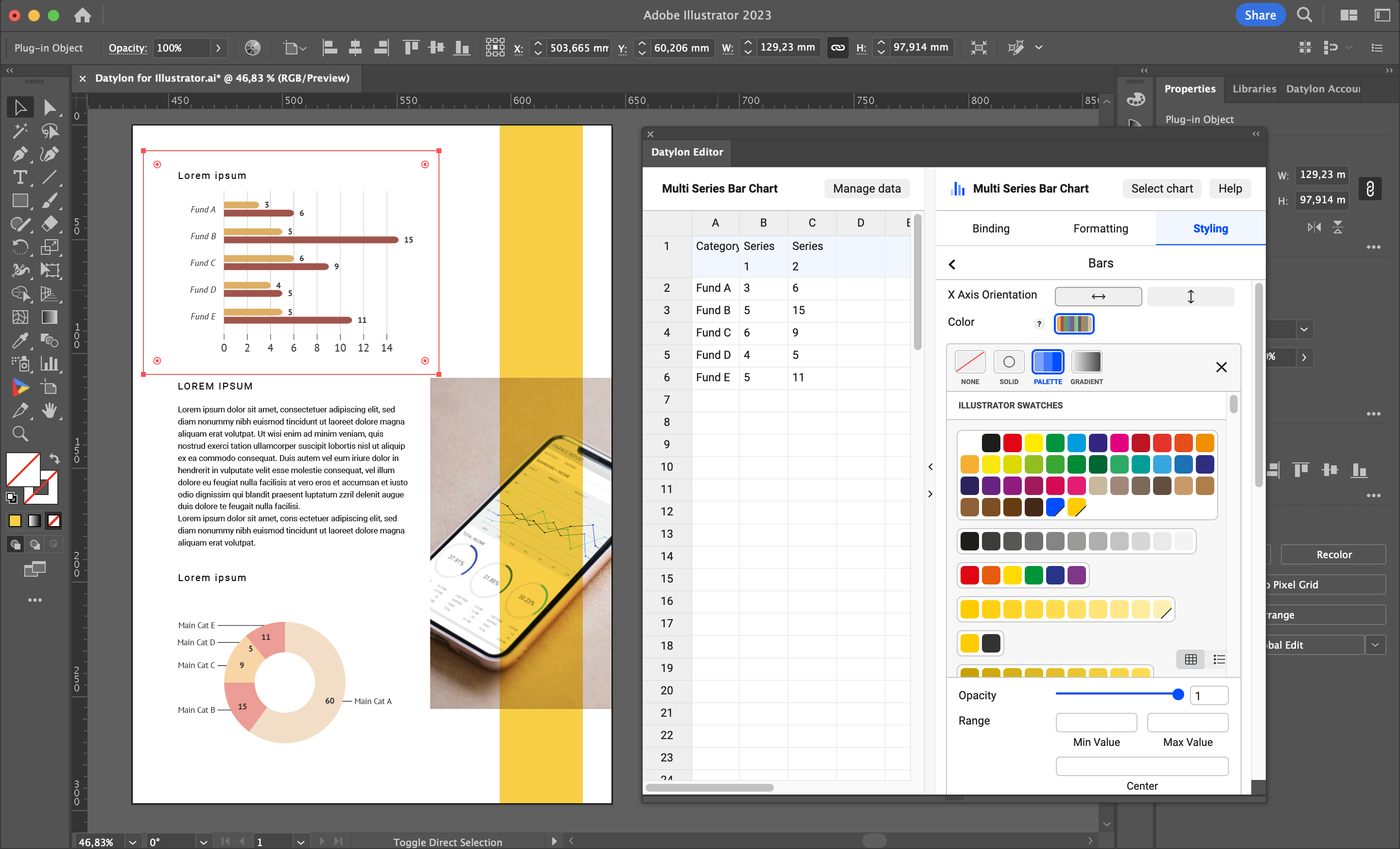
PROSNote: I’m a Datylon user in Adobe Illustrator environment. Datylon is great for big report projects: once you have set up your graph, you can apply it to several sets of data without any annoying “reset” issues from the Illustrator Graph tool.
CONSThe software lacks in consistency of features among the several graph types, especially the “Data label” feature, available only for Line graphs. I’ve been able to work this out by applying a Line graph w/data labels over Candle graphs, but it meant losing a lot of time in setting up both spreadsheets and Datylon graphs; some easy tweaks are not available (i.e.: in Data Labels, it will automatically delete leading zeros, even if the source data is set as text, and you can’t switch it off); in order to solve these issues, you need a good knowledge in both spreadsheet and Illustrator softwares.
Reason for choosing Datylon
Because of its integration with Adobe Illustrator, its graphic precision and customisation
Vendor Response
Hi Alexandros, Great to read you classify us as a "must have". But we acknowledge there is always room for improvement. We do have data labels on all our charts. But we are eager to hear what does not work for you so we can fix it. Don't hesitate to contact us via chat on our website or via getsupport@datylon.com The Datylon Team
Replied August 2021
Jeff
Design, 11-50 employees
Used daily for less than 6 months
OVERALL RATING:
3
EASE OF USE
3
VALUE FOR MONEY
4
FUNCTIONALITY
4
Reviewed March 2023
So much better than built-in Illustrator charting tools
Seems little daunting at first, but eventually started figuring something things out. I worry about my less technical designers getting into this thing. Its need much better tutorials, contextual help, and error handling. Also would like to see a way to do Sankey diagrams built in, and more letter-level control of type (like if I want to bold part of a label, or color a single word or something).
PROSI was on a design project that required a lot ofcharts, graphs, and other data visualization. Illustrator's built in tools are very lacking. Loved how many different chart types Datylon had out of the box. Gives designers a lot of options.
CONSIt's missing an undo feature. I messed something up, and it gives me an error in the plug-in screens but I have no idea where to fix it. Still displays the way i want so I just live with it. Also its a little hard to navigate and understand where the various settings I need are. Really needs contextual tool tips to help explain what everything does (with visual examples).
Reason for choosing Datylon
Seeing the examples of what you could do. Going to the site and seeing all the template options. I knew it'd have something I could work with.
Vendor Response
Hi Jeff, Thanks for the review! Some of the requests you have are already possible today and described in the Help Center (help.datylon.com). But feel free to book a call to discuss it using this link: https://www.datylon.com/book-a-demo-session or reach out to getsupport@datylon.com.
Replied April 2023
Stephanie
Architecture & Planning, 51-200 employees
Used weekly for less than 6 months
OVERALL RATING:
4
EASE OF USE
5
VALUE FOR MONEY
5
CUSTOMER SUPPORT
5
FUNCTIONALITY
4
Reviewed January 2024
Aesthetically pleasing data visualization tool
Overall it is a great tool to have, which directly plugs into Illustrator. It outputs very aesthetically satisfying graphics, which are easy to edit and customize. The tool is easy to learn, and if you have any questions they are happy to set up a video call to help you. Brilliant tool, brilliant service.
PROSDatylon is easy to use for those of us in the design industry, who are more visually trained. It is much quicker and easier to use than Power BI, and the graphic results are far more pleasing.
CONSAs all data has to be prepared prior to using Datylon, it can get a bit messy as it is not being drawn from one source. However, this also makes it simpler to use. It is disappointing that you cannot customize the icons (in the icons graphs) at present.
Reasons for switching to Datylon
I am not trained to use Power BI as my job does not entail detailed data management. I needed to produce some information visuals and found that Datylon is more akin to my skillset, and produces cleaner graphics.
Michael
Higher Education, 10,000+ employees
Used monthly for less than 12 months
OVERALL RATING:
4
EASE OF USE
2
VALUE FOR MONEY
5
FUNCTIONALITY
5
Reviewed July 2023
Great software, but interface is tricky to understand/use.
Being able to create a chart within Illustrator, then "expand" it and fine-tune customizations is fantastic. Otherwise, I've been exporting charts to .svg and bringing them into Illustrator, which is not as clever.
PROSIf there is a graph you need to create, Datylon can do it. The types of graphs and customizations for these graphs are nearly limitless.
CONSI really struggled to figure out a couple of basic features: it would be great if there were a way to create a histogram from a single column of data. I could not figure out how to do this. You need to create a "count" spreadsheet separately with a linear scale (1,2,3,4,5) according to the bins you want, then hide the x-axis of the resulting graph.I recognize this requires Datylon to perform math/calculations, but it sure would be helpful.Second, I have not figured out how to set the "zero" point for a diverging bar chart - the category/value that separates left and right sides of the chart. I'm wondering if it would be helpful to have, by graph type, a tab with feature settings particular to that graph type. It would clarify which options are available.
Reason for choosing Datylon
Visually, the graphs look cleaner. The other interfaces can be even more difficult to use.


