
What the Best Careers Pages Teach About Designing Your Own
Designing a careers page for your company’s website requires walking a fine line. It must be interesting enough to draw potential applicants in, but not overwhelming or cluttered, so that it confuses them or scares them away.
The branding and messaging has to be unique (your careers page is likely the 20th one a visitor has seen that day) but also sincere. Job seekers know when they’re being led on, and they can smell pandering from a mile away.
Your page needs to say: “Welcome! Take your time. Get a sense of how you could fit in here.”
But it also needs to say: “Please click on that ‘Apply’ button as soon as possible!”
It’s a difficult balance to strike, and research shows there’s a lot on the line if you get it wrong. An oft-cited study conducted by Stanford’s Persuasive Technology Lab found that a website’s design is the top factor in determining its credibility.
If you’re stuck or unsure, this article will help. Below we look at 10 of the best careers page designs from around the web and discover important lessons you can take away from each.
1. Google Teaches the Basics of Search, Structure and SEO
Why this page rocks: No matter where a visitor goes on Google’s sprawling careers page, they’re always just one click away from being able to search for positions or see a list of vacancies. Job seekers can filter the results by location, role, division, education required, date posted and more.
All of the positions follow the same structure (job title, division, department then location), and the option is available to add any job to a list of personal favorites to keep an eye on them.
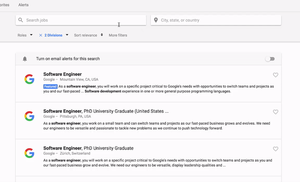
Source: Google
The takeaway: The creative flourishes on your careers page are crucial—and we’ll get to them below—but it will all be for naught if you can’t get the nuts and bolts right first. It’s important to ensure all of your job listings are formatted the same way, implement a working search function and make it easy for job seekers to apply for a position from anywhere on the site.
And, if you’re thinking about naming your accounting roles something quirky like “Number Gurus” to stand out, don’t. For search engine optimization (SEO) purposes, you should use the most popular phrase to describe each role so that job seekers can find your listings with ease.
2. Kickstarter Teaches How to Lure People Down the Page
Why this page rocks: You can click the “Current open positions” button at the top of Kickstarter’s careers page to go straight to the job postings at the bottom, but you won’t want to. A dark blue box against the light pink background peeking above the fold entices visitors to scroll down instead.
When they do, a combination of contrasting colors, short, snappy sentences (e.g., “We’re in New York City.”) and large photos of the Kickstarter workspace inform and entertain along the way.
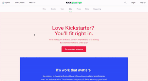
Source: Kickstarter
The takeaway: The longer you can keep job seekers on your careers page to hear your pitch, the more likely they’ll apply for a position.
To hold their attention, keep blocks of text short, use colors wisely and pack a ton of relevant, eye-catching visuals where you can. A 2014 Software Advice survey found that 51 percent of job seekers would be more attracted to a company that had job postings with visual elements (images or videos) than to a company that didn’t.
3. Spotify Teaches How to Put Your Product Front and Center
Why this page rocks: From the giant banner image at the top, showing workers dancing away at a party, to the text throughout, which asks job seekers if they want to “join the band,” Spotify sends a consistent message with their careers page that a love of music is not only ingrained in their company culture, but essential to being considered for a job.
The best example of this is a section about current employees that features curated Spotify playlists with some of their favorite songs.
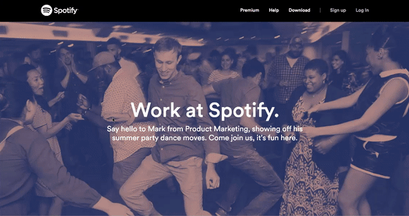
Source: Spotify
The takeaway: The more you can tie your company’s product or service into your branding as an employer—even jokingly—the better. Not only does it send a message that your workers are aligned with the organization’s end goals, but there’s also a higher chance that you’ll attract job seekers who are just as passionate about what your company does as you are.
An architecture firm might ask employees what their favorite famous building is, while a construction company could add stats about how many homes or businesses they’ve built. Get creative!
4. Adidas Shows How to Be Different
Why this page rocks: The statement “WE ARE 49°34′58″N — 010°54′34″E” linking to a map of the company’s headquarters in Germany isn’t the only odd thing about Adidas’ careers page. Going against conventional design, Adidas asks job seekers to use arrows to navigate the page left to right instead of up to down.
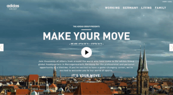
Source: Adidas
The takeaway: Little atypical design choices like this can help you stand out from the thousands of standard careers pages, so consider adding a fun animation or interaction to yours in line with your company’s mission or culture (e.g., a shipping company could ask visitors to “unbox” their careers page).
Just don’t go so overboard that it offends people or causes them not to take your company seriously. That means no emojis, no strobe lights and no embarrassing slang.
5. Digital Telepathy Teaches the Importance of Specifics
Why this page rocks: Digital Telepathy is a web UX design agency, which might explain why their careers page looks amazing. When you’re done admiring the eye-catching background video at the top and the page’s nice use of white space, check out the “A Day in the Life” section.
Starting with the team grabbing snacks and coffee in the kitchen at 8:32 in the morning, you can click an arrow to go through what a typical day looks like working at the Digital Telepathy office.
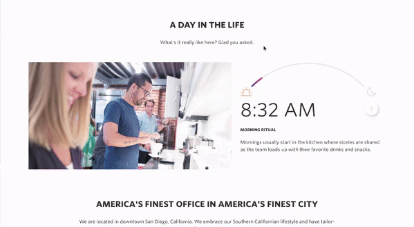
Source: Digital Telepathy
The takeaway: A job description and some stock photos aren’t enough to convey the full picture of what it’s like to work at your company, which is exactly what job seekers want a sense of.
Follow Digital Telepathy’s example and add a slideshow about a typical day at the office or shoot a video focusing on one employee’s week. You can even go a step further and incorporate virtual reality to better immerse job seekers in the experience.
6. Chipotle Teaches Why It’s Called a ‘Careers’ Page
Why this page rocks: Along with their list of job openings, Chipotle also has a “Career Path” section that ties them together. Visitors scrolling down the page will get a picture of how their salary and benefits will increase going from an entry-level crew member all the way up to restaurateur of multiple locations. Accompanying each rung of the ladder is a short video explaining what that job entails.
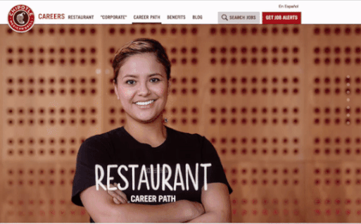
Source: Chipotle
The takeaway: No one wants to be stuck in a dead-end job. Where possible, your careers page should give job seekers a sense of how they can progress down the line. If you have any set succession paths for certain roles, detail them in an interesting graphic. At the very least, include some employee testimony highlighting how they’ve advanced in the company (and how quickly).
7. Eventbrite Teaches How to Give Job Seekers Options
Why this page rocks: If visitors go through the list of job openings at Eventbrite and don’t see anything that fits what they’re looking for, that’s OK. A link that says “Keep in touch” takes them to a special landing page where they can fill out a form with their name, email and department of interest to stay current on Eventbrite meetups, announcements and—most importantly—new opportunities.
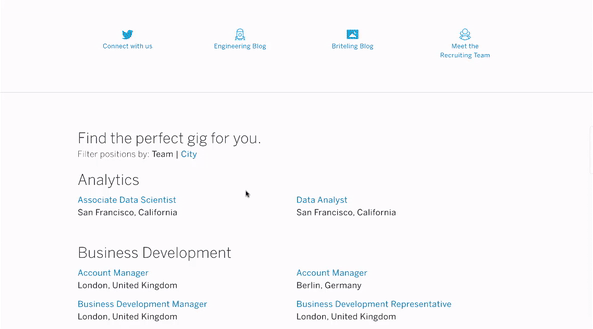
Source: Eventbrite
The takeaway: If the only options you’re giving job seekers is to apply for a specific position or take a hike, that’s going to leave a lot of opportunity on the table.
Whether it’s asking them to sign up for alerts like what Eventbrite does, or including a general application so talented individuals can tell you more about themselves and what they’re looking for, your careers page should always include alternative ways for visitors to stay on your radar without a specific role in mind. This is especially important for catering to passive candidates.
8. Comcast Teaches How to Keep Applicants In the Know
Why this page rocks: The frequently asked questions (FAQs) on Comcast’s careers page are neatly organized into sections for before someone applies (“How can I improve my chances of standing out during the application process?”), after they apply (“I submitted an application but I have not gotten a response. What do I do?”) and any technical headaches they might run into along the way.
Complementing the FAQs section is a tab detailing the seven steps of Comcast’s application process and a “Check Status” button for applicants to see where they stand.
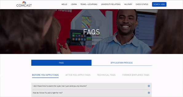
Source: Comcast
The takeaway: If applicants don’t know whether they’re two steps or 20 steps from being hired, they’ll take a sure thing somewhere else. Your careers page should include some information, even just a few paragraphs, about what they should expect after they apply to avoid confusion. An FAQ section is also an easy way to prevent applicants from bothering your busy team with tedious questions.
9. Typeform Teaches How to Optimize for Mobile
Why this page rocks: Accessing Typeform’s careers page on a smartphone gives you the same experience as viewing it on a computer. All of the text is in a big font so you can easily read it, and big buttons with icons for all of the available positions mean you don’t have to pinch and zoom your way around.
Best of all, Typeform’s response-based application form doesn’t require uploading a resume, which makes it easy to apply for positions from a mobile device.
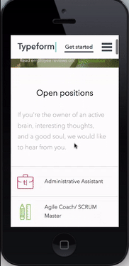
Source: Typeform
The takeaway: According to Pew Research Center, 28 percent of Americans have used a smartphone for at least part of their job search, and a CareerBuilder study adds that 65 percent of these workers will leave a web site if it is not mobile-optimized. If you don’t have a mobile-optimized careers page, you’re alienating a growing audience.
Whatever platform you use to build your careers page, make sure to test it out on multiple browsers and multiple devices to make sure that the experience isn’t compromised or frustrating. Mobile users should also be able to apply for a job without issue.
10. Bloomberg Teaches How to Remain Relevant Through Blogging
Why this page rocks: Bloomberg has a blog solely dedicated to a job seeking audience that is constantly updated with entries about diversity initiatives, philanthropy projects, career advice and more (with some humble bragging thrown in the mix as well—see “8 reasons why working at Bloomberg in 2016 was awesome”). Visitors can filter the blog entries by topic, or subscribe to see the latest posts via RSS.
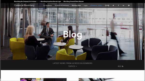
Source: Bloomberg
The takeaway: Job seekers want to know what your company is doing today, not what it was doing three years ago when you last updated your website. A blog is a great way to keep your careers page fresh and entice people to come back when they may be in a better position to apply.
Two to three short blogs a month about what’s going on at your company is all it takes.
Resources for Building the Perfect Careers Page
I know what you’re thinking. Of course the likes of Google, Bloomberg and Comcast have awesome careers pages—they have millions of dollars worth of resources available to pour into them. Meanwhile, you don’t even have a web developer to work with. How can you possibly practice what we’ve just preached?
Here are three options to create a functional, sleek-looking careers page without dedicated IT:
Preset themes and plug-ins. If your company’s website uses WordPress, Wix or any of the other popular site builders, there are a number of free and inexpensive careers page themes and plug-ins to choose from that you can customize to your needs without manual coding. JobCareer is just one example.
Applicant tracking systems. Alongside the ability to manage resumes and rank candidates, some applicant tracking systems (ATS) also have functionality to build careers pages with premade templates. Jobvite and SmartRecruiters are popular options here.
Recruitment marketing software. If you’re happy with your ATS as it is, recruitment marketing software products (also known as employer branding products) can integrate with your system and add functionality for things like creating a careers site, email marketing and managing employee referrals. Check out SmashFly or OnGig.
For more options to consider, head to our recruiting software page.