
Find the best Data Visualization Tools
Compare Products
Showing 1 - 20 of 441 products
Sort by
Reviews: Sorts listings by the number of user reviews we have published, greatest to least.
Sponsored: Sorts listings by software vendors running active bidding campaigns, from the highest to lowest bid. Vendors who have paid for placement have a ‘Visit Website’ button, whereas unpaid vendors have a ‘Learn More’ button.
Avg Rating: Sorts listings by overall star rating based on user reviews, highest to lowest.
A to Z: Sorts listings by product name from A to Z.


Domo
Domo
Domo puts data to work for everyone so they can multiply their impact on the business. Our cloud-native data experience platform goes beyond traditional business intelligence and analytics, making data visible and actionable with ...Read more about Domo

Grow
Grow
Grow is a cloud-based, business analytics and reporting solution suitable for small to midsize organizations. The solution allows users to create customizable dashboards for monitoring business workflows and key activities. Grow...Read more about Grow

ActivTrak
ActivTrak
ActivTrak helps companies unlock productivity potential. Our award-winning workforce analytics and productivity management software provides expert insights that empower people, optimize processes, and maximize technology. Addit...Read more about ActivTrak

Canva
Canva
Canva is a cloud-based graphic design tool used to create on-brand marketing content, sales presentations, training videos and more by companies of all sizes. This solution includes features such as drag-and-drop design and photo ...Read more about Canva
Talk with us for a free
15-minute consultationSoftware Advice is free because vendors pay us when they receive sales opportunities.
This allows us to provide comprehensive software lists and an advisor service at no cost to you.
This allows us to provide comprehensive software lists and an advisor service at no cost to you.


Meet Eric, a software expert who has helped 1,534 companies select the right product for their needs.
Talk with us for a free
15-minute consultationSoftware Advice is free because vendors pay us when they receive sales opportunities.
This allows us to provide comprehensive software lists and an advisor service at no cost to you.
This allows us to provide comprehensive software lists and an advisor service at no cost to you.
Tell us more about your business and an advisor will reach out with a list of software recommendations customized for your specific needs.
STEP 1 OF 4
How many are in your organization?
Google Analytics 360
Google Analytics 360
Google Analytics 360 is an enterprise-level analytics platform with in-depth performance indicators, such as ROI analysis reports. The app's primary function is to provide insights into customer behavior interactions with websites...Read more about Google Analytics 360
Visio
Visio
Visio, a Microsoft 365 solution, is a diagramming tool that can be used by businesses of all sizes to create visual charts for team collaboration. With Visio, teams can connect diagrams and charts to real-time data and automate wo...Read more about Visio

Tableau
Tableau
Tableau is an integrated business intelligence (BI) and analytics solution that helps to analyze key business data and generate meaningful insights. The solution helps businesses to collect data from multiple source points such as...Read more about Tableau
MATLAB
MATLAB
MATLAB is a programming platform designed to help businesses and educational institutions develop algorithms, analyze data, create applications and more. MATLAB's live editor lets businesses create scripts to combine formatted t...Read more about MATLAB

Google Cloud
Google Cloud
Featuring G-Suite and GCP, Google Cloud is a platform that provides a reliable and easy-to-use set of solutions that can be used to tackle the toughest challenges in any type of industry. It provides secure storage options, integr...Read more about Google Cloud
Microsoft Power BI
Microsoft Power BI
Microsoft Power BI is a web-based business analytics and data visualization platform that is suitable for businesses of all sizes. It monitors important organizational data and also from all apps used by organizations. Microsoft P...Read more about Microsoft Power BI

Miro
Miro
Miro is a visual workspace for innovation that enables distributed teams of any size to dream, design, and build the future together. Miro enables distributed teams to come together to synthesize information, clarify complex idea...Read more about Miro

Google Charts
Google Charts
Google Charts is a cloud-based business intelligence solution designed to help teams visualize data on their websites in the form of pictographs, pie charts, histograms and more. Key features include content management, custom das...Read more about Google Charts

Visme
Visme
Visme is a cloud-based platform, which helps agencies, non-profit organizations and marketers create and share infographics in real-time. The software allows teams to utilize customizable templates and content blocks to create pre...Read more about Visme

Sisense
Sisense
Sisense goes beyond traditional business intelligence by providing organizations with the ability to infuse analytics everywhere, embedded in both customer and employee applications and workflows. Sisense customers are breaking th...Read more about Sisense

Google Data Studio
Google Data Studio
Google Data Studio is a cloud-based reporting solution designed to help small to large businesses customize, share and visualize data through configurable charts and tables. Features include team collaboration, filtered views, cus...Read more about Google Data Studio

Minitab
Minitab
Minitab is a cloud-based statistical tool designed to help small to large organizations across various verticals such as manufacturing, healthcare, energy, automotive or non-profit discover market trends, predict patterns and visu...Read more about Minitab

Zoho Analytics
Zoho Analytics
Zoho Analytics is a cloud-based reporting and business intelligence solution that offers several applications within its suite, including dashboards, analysis, reporting, data warehousing and more. This solution is used in multipl...Read more about Zoho Analytics

Logi Symphony
Logi Symphony
Logi Symphony is a highly flexible browser-based embedded business intelligence (BI) and analytics platform. Software teams use Logi Symphony to embed interactive managed dashboards, self-service dashboards, and pixel-perfect repo...Read more about Logi Symphony

Qlik Sense
Qlik Sense
Qlik Sense is a business intelligence (BI) and visual analytics platform that supports a range of analytic use cases. Built on Qlik’s unique Associative Engine, it supports a full range of users and use-cases across the life-cycle...Read more about Qlik Sense

Looker
Looker
Looker, now part of Google Cloud, is a cloud-based business intelligence (BI) platform designed to explore and analyze data. The solution helps businesses to capture and analyze data from multiple sources and make data-driven deci...Read more about Looker
Popular Comparisons


Buyers Guide
Last Updated: March 16, 2023Data visualization software helps companies make sense of their vast data stores by providing graphical representations of key information. These tools make it easy for ordinary, non-IT users to quickly view data in an easy-to-understand format and assess it so they can make better, more informed decisions. Data visualization solutions are particularly helpful for illustrating data that can be presented with executives or clients who want to quickly understand important insights and trends without having to perform deep data dives themselves.
Many data visualization tools also offer the ability to download, share and embed visualizations, which gives organizations a way to provide internal and external parties greater visibility into performance.
There are a wide range of data visualization solutions on the market available to buyers. We've created this guide to help you better understand what data visualization solutions are, the benefits they can offer your organization and what important considerations to keep in mind when selecting a system to purchase.
Here's what we'll cover:
What Is Data Visualization Software?
Common Features of Data Visualization Software
Benefits of Data Visualization Software
Pricing: Web-Based vs. On-Premise
What Is Data Visualization Software?
Data visualization software processes information from an organization's databases and presents it in graphical form. These visualizations range from simple charts and graphs to complex flow charts and geographical maps. Many of these visualizations are interactive, allowing users to adjust certain settings and see the impact in real-time.
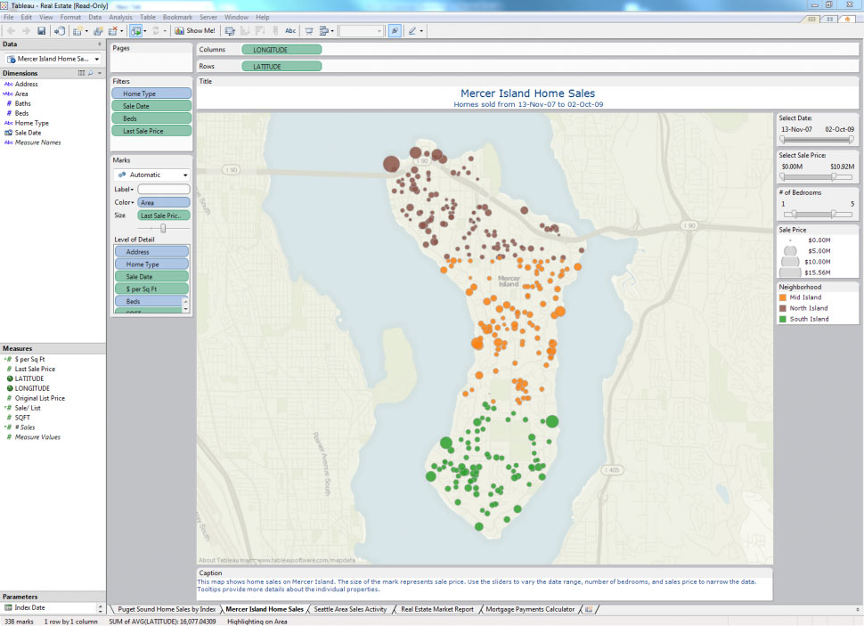
_Geographical data mapping using Tableau
Features of Data Visualization Software
The breadth and depth of data visualization tools will vary depending on the type of solution. A simple stand-alone data visualization tool, for example, will likely offer fewer and less robust features than a tool that is part of a fully integrated business intelligence solution that includes multiple other applications for data reporting, predictive analytics, data mining, and so on. Regardless, most data visualization software usually offers some or all of the following functionality:
Basic visualizations | A variety of visuals and chart types to choose from (e.g., infographics, heat maps, fever charts). |
Interactive capabilities | E.g., drag-and-drop, drill-down functionality. |
Data/event alerts | Alerts to let users know when data is updated or certain events occur. |
Data visualization sharing | The ability to share visualizations with both internal and external parties. |
Import/export | The ability to import Excel and other data files and export visualizations into different formats and embed them into web pages. |
Benefits of Data Visualization Software
Data visualizations enable users to more readily analyze information, gain insights and discover trends. This makes users more efficient because they spend more time asking questions and getting answers, and less time interpreting numbers and creating graphics.
Here are a few ways that data visualization software can assist users in gaining insights from their data:
Geographical maps. Mapping data can help users discover geographical trends that may have gone unnoticed in traditionally analyzed data sets. Users can utilize these visualizations to pinpoint geographic strengths and weaknesses and find ways to address them.
Heat maps. Heat maps are 2D data visualizations that use colors to represent different values in order to provide users with a quick and easy way to understand how these values are performing relative to one another. They are similar in nature to fractal maps and tree maps, all of which use different colors to represent a hierarchy of variables. They can be particularly helpful when analyzing how users interact with web pages. For example, a heat map that analyzes web page engagement might show areas of the page that users spent the most time on in colors such as red, orange and yellow, while the areas of the page that had less user interaction with might appear in blue, green and purple shades.
Timelines. Plotting data in a time series is a common way for businesses to track success. With data visualization software, users can constantly adjust parameters to adjust both the metrics considered (e.g., revenue, profit or margins) as well as the relevant timeframe.
Workflow representations. These visualizations allow users to quickly understand the progress of a particular item within a project. By nesting individual workflows under multiple levels of a larger project, both frontline managers and executives can understand at a glance where particular activities stand.
Key Considerations for Buyers
You should consider the following when evaluating data visualization applications:
Do you need a stand-alone data visualization tool or an integrated BI application? Is more advanced BI functionality—such as that included in predictive analytics and forecasting systems—a necessity? If so, you should consider a BI application with integrated visualization, reporting and analysis functionality.
Is mobile BI on your roadmap? Mobile BI is one of the biggest trends in business analytics, and most vendors currently offer at least some functionality on mobile devices. Visualization applications will often require the larger tablet screen to be effective. If you plan on using mobile devices to access visualization applications, ensure that the vendors you evaluate provide support for popular tablets (e.g., Apple iPad and Android-based tablets).
Pricing: Web-Based vs. On-Premise
Buyers of data visualization software have the option to choose between web-based (also known as cloud-based) deployment or on-premise deployment.
Systems using a cloud-based deployment model deliver “Software-as-a-Service” (SaaS); this is also known as “web-based software.” In this model, the software is hosted (meaning housed, served, maintained and delivered) remotely, on the vendor’s or service provider’s own servers. It is then accessed by users through any device that is both compatible with the system and has an internet connection, which gives users the ability to use the tool anywhere, anytime.
With on-premise deployment, the software system is hosted in-house, on the user’s own servers. Data in the database and all associated applications are housed and run locally, and users may or may not be able to access the system remotely (depending on whether or not the system is compatible with mobile devices and remote computers).
While larger companies will often have the IT resources to host a solution in-house, this can be a costly option for smaller companies. Smaller organizations may thus want to consider cloud-based solutions, which are usually faster and easier to implement and are less costly to manage and update. However, cloud-based solutions may not include the type of robust functionality that a more comprehensive, on-premise BI solution might.