

Best Data Visualization Software of 2026
Updated March 26, 2026 at 1:26 PM
- FrontRunners
- Popular Comparisons
- Buyers Guide
Compare Products
Showing 1 - 25 of 434 products
Compare Products
Sort by
Reviews: Sorts listings by the number of user reviews we have published, greatest to least.
Average Rating: Sorts listings by overall star rating based on user reviews, highest to lowest.
Alphabetically (A-Z): Sorts listings by product name from A to Z.

Grow is a cloud-based, business analytics and reporting solution suitable for small to midsize organizations. The solution allow...Read more about Grow
Grow's Best Rated Features
See All
Grow's Worst Rated Features
See All

SAS Viya is a cloud-native platform designed for data analytics, machine learning and data management. It supports organizations...Read more about SAS Viya
SAS Viya's Best Rated Features
See All
SAS Viya's Worst Rated Features
See All

SAP BTP is a solution for businesses of all sizes. It provides a single platform to manage all aspects of business transformatio...Read more about SAP BTP
No reviews yet
recommendations

Canva is a cloud-based graphic design tool used to create on-brand marketing content, sales presentations, training videos and m...Read more about Canva
Canva's Best Rated Features
See All
Canva's Worst Rated Features
See All

OriginPro is a cloud-based data analysis and graphing solution, which assists academic institutions, government organizations, n...Read more about OriginPro
OriginPro's Best Rated Features
See All
OriginPro's Worst Rated Features
See All

Piktochart is a cloud-based visual content maker that can be used to create presentations, infographics, social media graphics, ...Read more about Piktochart
Piktochart's Best Rated Features
See All
Piktochart's Worst Rated Features
See All

Entrinsik Informer is a business intelligence tool that is designed for business and IT professionals. Key features include a da...Read more about Informer

Upgrade to Reach Reporting. AI-Enhanced Financial Reporting Automated reports, deep analysis, and visualized data in seconds, ...Read more about Reach Reporting
Reach Reporting's Best Rated Features
See All
Reach Reporting's Worst Rated Features
See All

Google Analytics 360 is an enterprise-level analytics platform with in-depth performance indicators, such as ROI analysis report...Read more about Google Analytics 360
Google Analytics 360's Best Rated Features
See All
Google Analytics 360's Worst Rated Features
See All

CanvasJS is a data visualization tool that helps businesses render charts utilizing various frameworks such as React, Angular, V...Read more about CanvasJS Charts
CanvasJS Charts 's Best Rated Features
See All
CanvasJS Charts 's Worst Rated Features
See All

Fluent (formerly Windward Core) is a powerful document generation platform combining an MS Office designer plugin, a centralized...Read more about Fluent

Google Cloud is a suite of cloud computing services that allows businesses to build, deploy, and scale applications. The platfor...Read more about Google Cloud
Google Cloud's Best Rated Features
See All
Google Cloud's Worst Rated Features
See All

datapine is a business intelligence software designed to empower companies in exploring, visualizing, analyzing, and sharing the...Read more about datapine

Toucan Toco offers a powerful embedded analytics solution designed to help businesses unlock the full potential of their data. W...Read more about Toucan
Toucan's Best Rated Features
See All
Toucan's Worst Rated Features
See All

Phocas is a SaaS platform designed to help mid-market businesses in manufacturing, wholesale distribution, and retail make data-...Read more about Phocas
Phocas's Best Rated Features
See All
Phocas's Worst Rated Features
See All

Effortlessly create and display real-time TV dashboards with Geckoboard. Tailored for busy team leads and managers, Geckoboard...Read more about Geckoboard
Geckoboard's Best Rated Features
See All
Geckoboard's Worst Rated Features
See All

Klipfolio Klips is a powerful dashboard and reporting platform designed to help small and mid-sized businesses grow, align teams...Read more about Klips
Klips's Best Rated Features
See All
Klips's Worst Rated Features
See All

With its low-code platform for creating industrial applications, Peakboard GmbH supports production and logistics companies in m...Read more about Peakboard
Peakboard's Best Rated Features
See All
Peakboard's Worst Rated Features
See All

EasyReports was built keeping in mind the typical pain points in the reporting functions in organizations. For end users the pro...Read more about EasyReports

Discover actionable insights in your data silos! Lumenore democratizes business intelligence with no-code analytics. Empower yo...Read more about Lumenore
Lumenore's Best Rated Features
See All
Lumenore's Worst Rated Features
See All

Location Insights you can trust. CleverMaps is a map-based analytics platform transforming how the world is using data to solve...Read more about CleverMaps

BrightGauge is a business intelligence solution that enables enterprises to gain visibility into key performance indicators (KPI...Read more about BrightGauge
BrightGauge's Best Rated Features
See All
BrightGauge's Worst Rated Features
See All

Infoveave is a data platform that integrates data automation, analytics, and AI capabilities to transform raw data into actionab...Read more about Infoveave

Open Automation Software is an industrial Internet of Things (IoT) suite designed to help businesses connect data sources to the...Read more about Open Automation Software

Rapid Insight is an on-premise Business Intelligence solutions for higher education institutions and fundraising, healthcare and...Read more about Rapid Insight Construct
Popular Comparisons


Your Guide to Top Data Visualization Software, February 2025
Software Advice uses reviews from real software users to highlight the top-rated Data Visualization products in North America.
Learn how products are chosenExplore FrontRunners

“Usability” includes user ratings for Functionality and Ease of Use.
“Customer Satisfaction” includes user ratings for Customer Support, Likelihood to Recommend and Value for Money.
Reviews analysis period: The reviews analysis period spans two years and ends the 15th of the month prior to publication.
Buyers Guide
This detailed guide will help you find and buy the right data visualization software for you and your business.
Last Updated on January 27, 2025Data visualization software helps companies make sense of their vast data stores by providing graphical representations of key information. These tools make it easy for ordinary, non-IT users to quickly view data in an easy-to-understand format and assess it so they can make better, more informed decisions. Data visualization solutions are particularly helpful for illustrating data that can be presented with executives or clients who want to quickly understand important insights and trends without having to perform deep data dives themselves.
Many data visualization tools also offer the ability to download, share and embed visualizations, which gives organizations a way to provide internal and external parties greater visibility into performance.
There are a wide range of data visualization solutions on the market available to buyers. We've created this guide to help you better understand what data visualization solutions are, the benefits they can offer your organization and what important considerations to keep in mind when selecting a system to purchase.
Here's what we'll cover:
What Is Data Visualization Software?
Common Features of Data Visualization Software
Benefits of Data Visualization Software
Pricing: Web-Based vs. On-Premise
What Is Data Visualization Software?
Data visualization software processes information from an organization's databases and presents it in graphical form. These visualizations range from simple charts and graphs to complex flow charts and geographical maps. Many of these visualizations are interactive, allowing users to adjust certain settings and see the impact in real-time.
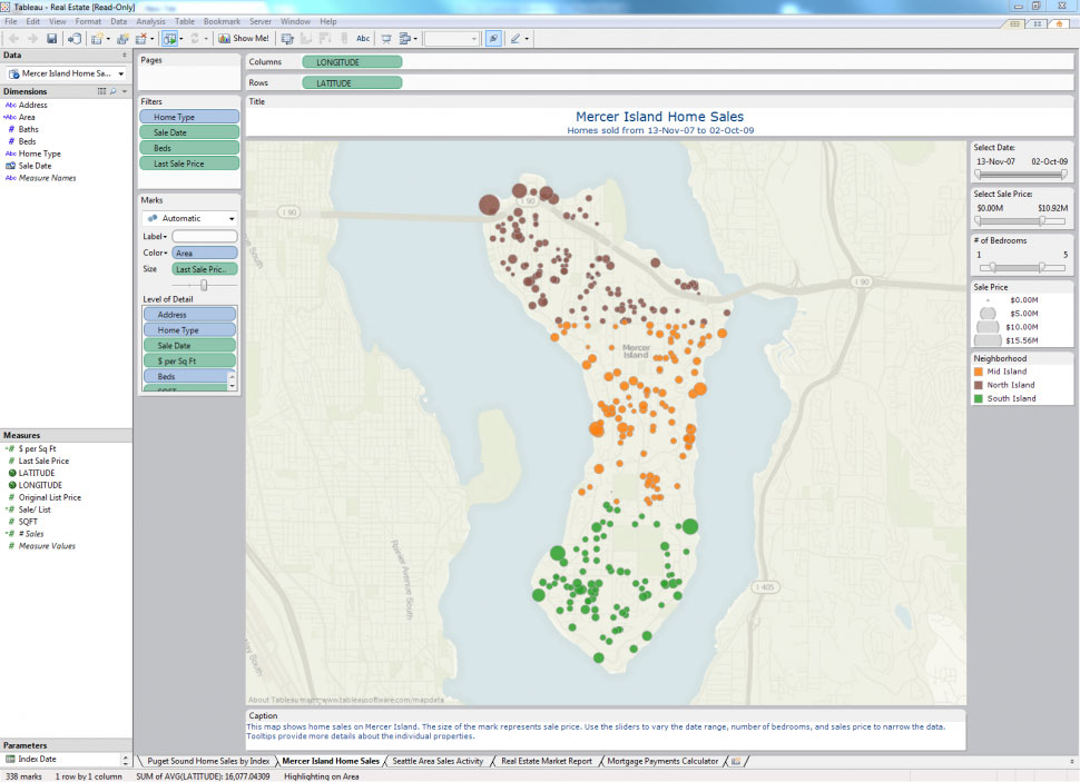
_Geographical data mapping using Tableau
Features of Data Visualization Software
The breadth and depth of data visualization tools will vary depending on the type of solution. A simple stand-alone data visualization tool, for example, will likely offer fewer and less robust features than a tool that is part of a fully integrated business intelligence solution that includes multiple other applications for data reporting, predictive analytics, data mining, and so on. Regardless, most data visualization software usually offers some or all of the following functionality:
Basic visualizations | A variety of visuals and chart types to choose from (e.g., infographics, heat maps, fever charts). |
Interactive capabilities | E.g., drag-and-drop, drill-down functionality. |
Data/event alerts | Alerts to let users know when data is updated or certain events occur. |
Data visualization sharing | The ability to share visualizations with both internal and external parties. |
Import/export | The ability to import Excel and other data files and export visualizations into different formats and embed them into web pages. |
Benefits of Data Visualization Software
Data visualizations enable users to more readily analyze information, gain insights and discover trends. This makes users more efficient because they spend more time asking questions and getting answers, and less time interpreting numbers and creating graphics.
Here are a few ways that data visualization software can assist users in gaining insights from their data:
Geographical maps. Mapping data can help users discover geographical trends that may have gone unnoticed in traditionally analyzed data sets. Users can utilize these visualizations to pinpoint geographic strengths and weaknesses and find ways to address them.
Heat maps. Heat maps are 2D data visualizations that use colors to represent different values in order to provide users with a quick and easy way to understand how these values are performing relative to one another. They are similar in nature to fractal maps and tree maps, all of which use different colors to represent a hierarchy of variables. They can be particularly helpful when analyzing how users interact with web pages. For example, a heat map that analyzes web page engagement might show areas of the page that users spent the most time on in colors such as red, orange and yellow, while the areas of the page that had less user interaction with might appear in blue, green and purple shades.
Timelines. Plotting data in a time series is a common way for businesses to track success. With data visualization software, users can constantly adjust parameters to adjust both the metrics considered (e.g., revenue, profit or margins) as well as the relevant timeframe.
Workflow representations. These visualizations allow users to quickly understand the progress of a particular item within a project. By nesting individual workflows under multiple levels of a larger project, both frontline managers and executives can understand at a glance where particular activities stand.
Key Considerations for Buyers
You should consider the following when evaluating data visualization applications:
Do you need a stand-alone data visualization tool or an integrated BI application? Is more advanced BI functionality—such as that included in predictive analytics and forecasting systems—a necessity? If so, you should consider a BI application with integrated visualization, reporting and analysis functionality.
Is mobile BI on your roadmap? Mobile BI is one of the biggest trends in business analytics, and most vendors currently offer at least some functionality on mobile devices. Visualization applications will often require the larger tablet screen to be effective. If you plan on using mobile devices to access visualization applications, ensure that the vendors you evaluate provide support for popular tablets (e.g., Apple iPad and Android-based tablets).
Pricing: Web-Based vs. On-Premise
Buyers of data visualization software have the option to choose between web-based (also known as cloud-based) deployment or on-premise deployment.
Systems using a cloud-based deployment model deliver “Software-as-a-Service” (SaaS); this is also known as “web-based software.” In this model, the software is hosted (meaning housed, served, maintained and delivered) remotely, on the vendor’s or service provider’s own servers. It is then accessed by users through any device that is both compatible with the system and has an internet connection, which gives users the ability to use the tool anywhere, anytime.
With on-premise deployment, the software system is hosted in-house, on the user’s own servers. Data in the database and all associated applications are housed and run locally, and users may or may not be able to access the system remotely (depending on whether or not the system is compatible with mobile devices and remote computers).
While larger companies will often have the IT resources to host a solution in-house, this can be a costly option for smaller companies. Smaller organizations may thus want to consider cloud-based solutions, which are usually faster and easier to implement and are less costly to manage and update. However, cloud-based solutions may not include the type of robust functionality that a more comprehensive, on-premise BI solution might.